


1
2
3
4
5
6
7
8
9
10
11
12
13
14
15
16
17
18

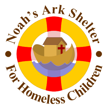
Noah's Ark Shelter for Homeless Children
The Noah's Ark Shelter for Homeless Children is based in Tegucigalpa, Honduras and is a part of Baptist Medical & Dental Mission International (BDMI), which commissioned this logo. The life buoy reinforces both the nautical and rescue themes and gives the logo a round shape to match the BMDMI logo. The red bands coincide with a cross in the background and another cross forms a window on the ark. Warm tones of gold and brown reflect the warmth this ministry extends. The brightness of the red, gold, and blue hint at primary colors which are associated with children. The crimson, crosses, buoy, and ark represent the message of salvation through the blood shed by the Christ.
Copyright 1999 Craig Edward Given
QDK/CCL
This is the shqip version (the language of Albania) of the logo for the Center for Christian Leadership (CCL) based in the capitol of Tirana. I used a cross/arrow combination to convey the idea of Christian leadership. The school aspired to a global impact so I incorporated a globe into the logo with the arrow pointing at Albania. The logo was also created in an English version. And a simplified globe without continents was used for printing at small sizes.
Copyright 1999 Craig Edward Given
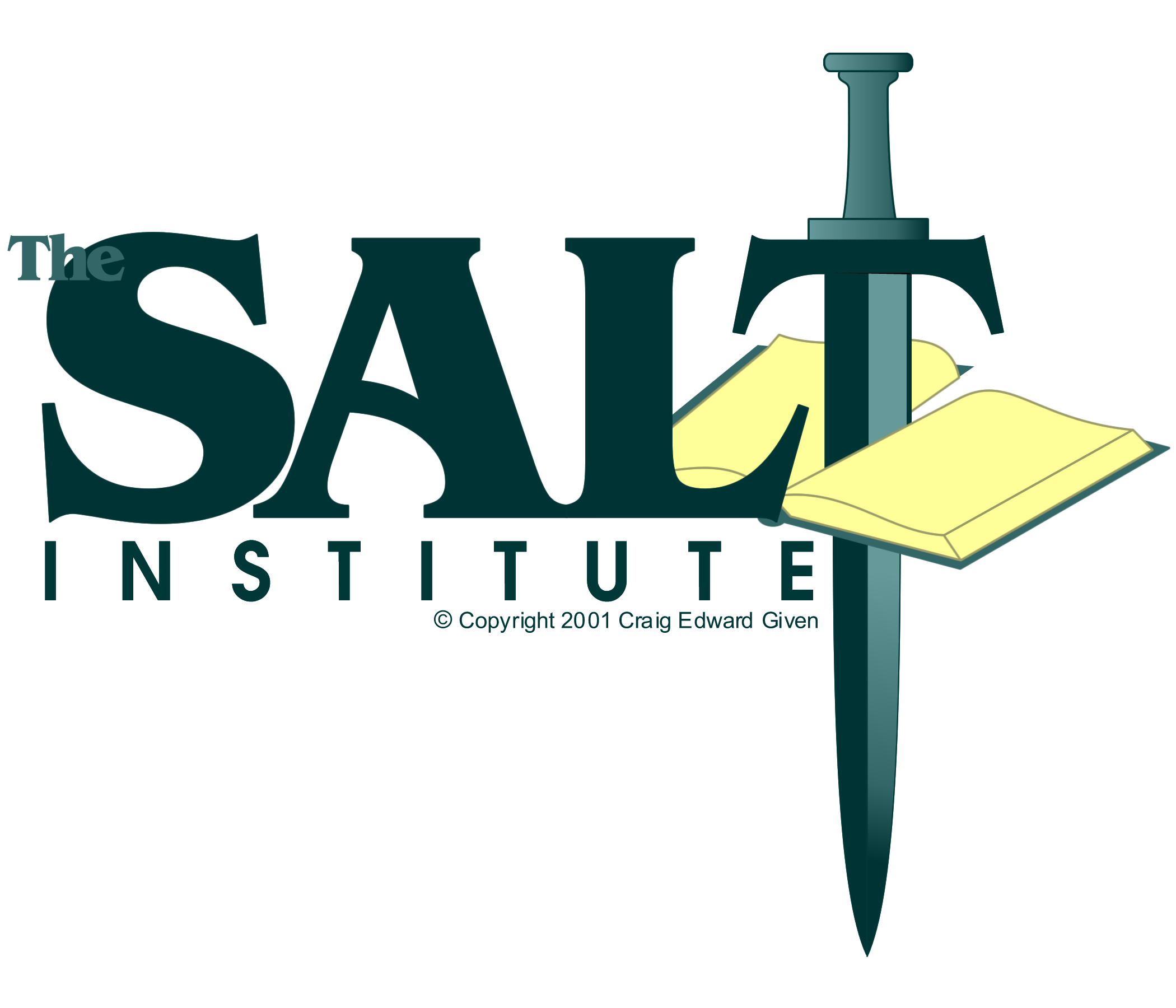
SALT Institute
In 1996 I created the Timothy School logo: the letter T as a sword cutting through a Bible. This signified the Greek word orthotomeo (literally straight + cut) from the 2nd Timothy 2:15, the school's theme verse. In that verse orthotomeo is the admonishment to Christians to "accurately handle" the Word of God, which also was the focus of training for the students.
In 2001 the school wanted to emphasize that ministers should have a servant's heart and asked me to come up with a new name and logo. Thus, the SALT Institute comes from my acronym for "Servant Approach Leadership Training" and the Biblical concept that Christians should be "salt" (Mt. 5:13). To represent its heritage I built the SALT Institute logo from the Timothy School logo.
Copyright 2001 Craig Edward Given
Intercessors Online
This logo was created in 2002 for the IOL website, which is an online prayer ministry.
Copyright 2002 Craig Edward Given
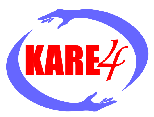
KARE4
KARE4: Bringing long term care, building life long relationships.
KARE4 stands for the Kosovar Albanian Relief Endeavor and was a play on the phrase "Care For." The 4 also represents the four regions impacted by the Kosovo War of 1998 and 1999 war: Kosovo, Albania, Montenegro, and Macedonia (the latter three having high concentrations of Kosovar Albanian refugees). The hands (and the psychological calmness of blue) represent the gentleness, and caring while the sweeping arcs suggest a globe. The text is in red, which is the main color of the Albanian and Kosovar flags.
PENTEX
The Pentex Training Series was large compilation of teacher and student materials to equip Christians in rewarding and accurate Bible study. The logo and name comes from the Greek word pente meaning "five" and represents the five Xs of the training sequence: eXamine, eXegete, eXemplify, eXpose, and eXpand. Five X characters were rendered as crosses to symbolize the Christian element. They were then combined to show the unifying and dependent nature of all five elements.
Copyright 2003 Craig Edward Given
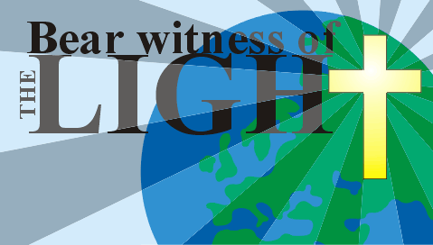
Bear Witness
The banner for the 1998 Missions Conference at Woodland Bark Baptist Church. It refers to the conference theme verse of John 1:7 "He [John the Baptist] came for a witness, that he might bear witness of the light, that all might believe through him" The image is in proportion to the 5 foot by 10 foot canvas panel used for the banner. The artwork was also adapted for attendee name tags.
Copyright 1998 Craig Edward Given
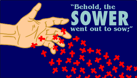
Behold the Sower
The banner design was commissioned by Woodland Park Baptist Church for the 1999 Missions Conference. It refers to conference's theme verse "Behold, the sower went out to sow;" (Mt. 13:3). The image is in proportion to the 5 foot by 10 foot canvas panel used for the banner. The design was also used name tags and the conference's brochure cover. The hand was drawn in pen & ink before being digitally scanned and then vectorized for use in CorelDraw.
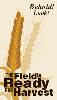
Harvest
This banner was commissioned by Woodland Park Baptist Church for their missions conference in 2000. Their theme verse was John 4:35 "Behold! Look! The field is ready for harvest." The entire work uses warm browns and golds (even the text is a complimentary dark walnut) to fit the "harvest" color theme. The wheat shafts in the background are of a lower contrast in order to bring out the single shaft in the foreground, and to accentuate it's unique grains. Unlike the background wheat, the foreground shaft is not covered with grains of wheat. Instead it is covered with the fish symbol (the Greek IXTHUS used by early Christians) and also harkens to the call of Christ to "Follow Me, and I will make you become fishers of men." (Mark 1:17)
Copyright 2000 Craig Edward Given
Music Ministry Network
This logo was commissioned in 2001 by Shane Pilcher for the Music Ministry Network (MMN). This organization facilitates the networking of people in the music ministry to support each other. (for example, song writers to find singers for their works).
Copyright 2001 Craig Edward Given
Third Monday
This logo was created for ChristWay Community Church in Chattanooga, Tennessee for their "Third Monday of the Month" program (teacher training).
Copyright 2004 Craig Edward Given
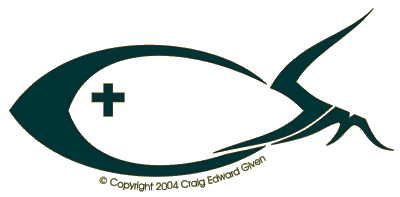
CSM
The ChristWay Student Ministry (CSM) commissioned this logo in 2004. Their abbreviation was transformed into the traditional IXTHUS (fish) symbol for Christianity, with the addition of a cross for the eye.
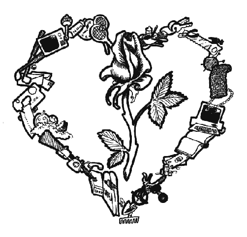
Sweethearts Banquet
This design was commissioned as a program cover for a Valentine's day banquet. The event was attended by young marrieds so the outline of the heart was formed of every day items that represent the fact that marriage extends beyond those initial romantic days. The rose represents the fact that romance must be maintained with commitment amidst many distractions. The work was produced in pen & ink in 1992.
Copyright 1992 Craig Edward Given
Vision Phone Fans
This 2002 logo was for Vision Phone Fans and incorporates a candy-bar cell phone (in vogue at the time) into the letter "V." At the time, Sprint was offering a revolutionary service that let their customers customize ringtones, caller ID images, and even programs without the typically high per-item pricing and limited locked-in offerings.
Catharsis
This experiment in typography was created by a Rotring Rapidograph pen while living in Craigsville, WV.
Copyright 1979 Craig Edward Given
OHS Marching Band 2005: PIT
This T-Shirt design was commissioned for the Ooltewah High School Marching Band's PIT (percussion instruments team). Their 2005 musical performance included a mausoleum, tombstones and graveyard fence as props, with performers dressed in skeleton outfits and skull makeup. Their performance incorporated Michael Jackson's "Thriller," Danny Elfman's themes "BeetleJuice" and "Tales from the Crypt," and "Danse Macabre" by Camille Saint-Saëns. So I combined the theme of skeletons with the dominance of marimbas, xylophones, vibraphones, and glockenspiels played by the PIT.
Hells Bells
Commissioned for the Ooltewah High School Marching Band. The theme of their 2006 program was bells and this design was for a team shirt for the percussion group. In this rendition I've digitally added a black background since it was for black T-shirts.
Copyright 2006 Craig Edward Given
Paul Keith Designs
PKD (Paul Keith Designs) is from 1999 and was a logo for a textile artists website.